
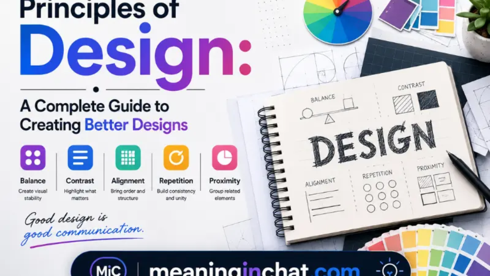
Good design is not simply about choosing attractive colors, stylish fonts, or interesting pictures. A successful design works because its different parts are arranged with purpose. This is where the principles of design become important.
Whether you are designing a website, mobile app, poster, logo, presentation, social media graphic, advertisement, or printed material, design principles help you organize visual information and communicate an idea clearly.
There is no single universally accepted list of design principles. Different designers and educational resources group them differently. However, several concepts appear repeatedly, including contrast, balance, emphasis, proportion, hierarchy, repetition, rhythm, white space, movement, variety, and unity.
This guide explains the major principles of design, why they matter, and how you can use them in practical projects.
What Are the Principles of Design?
The principles of design are guidelines that help designers arrange visual elements in a way that is clear, attractive, functional, and meaningful.
Design elements include things such as:
- Color
- Typography
- Lines
- Shapes
- Images
- Icons
- Textures
- Space
- Size
The principles explain how these elements should work together.
For example, a headline may be made larger than the surrounding text to establish hierarchy. A contrasting color can draw attention to a button. Empty space can separate two sections and make a page easier to understand.
In simple terms, design elements are the ingredients, while design principles describe how those ingredients are organized.
Why Are Principles of Design Important?
A design can contain beautiful individual elements and still feel confusing if they are not arranged properly.
Design principles help solve that problem by giving the designer a visual framework.
They can help you:
- Organize information
- Direct the viewer’s attention
- Improve readability
- Create visual consistency
- Make important information noticeable
- Reduce clutter
- Build a recognizable visual style
- Improve user understanding
- Create stronger compositions
For digital products, these ideas are especially important because people often scan rather than carefully read every part of a screen. Visual hierarchy, spacing, contrast, and movement can therefore influence how quickly someone understands a page.
Principles of Design
Contrast
Contrast is created when two or more visual elements are noticeably different.
The difference can involve:
- Color
- Size
- Shape
- Weight
- Texture
- Typography
- Spacing
For example, placing dark text on a light background creates contrast. Making a headline much larger than the body text creates another type of contrast.
Contrast helps viewers identify what deserves attention first.
How to use contrast
You can use contrast to:
- Highlight a headline
- Make a button noticeable
- Separate sections
- Improve readability
- Create visual interest
However, contrast should have a purpose. Too many competing differences can make a composition feel disorganized.
Accessibility is another reason contrast matters, particularly when designing interfaces and text-based content. Poor contrast can make information difficult to read.
Balance
Balance describes how visual weight is distributed across a composition.
Every element has some visual weight. A large photograph may attract more attention than a small paragraph, while a strong color may feel heavier than a pale background.
There are several ways to achieve balance.
Symmetrical balance
Elements are arranged in a relatively equal way around a central axis.
This often creates a feeling of:
- Stability
- Order
- Formality
- Reliability
Asymmetrical balance
Different elements have different visual weights but are arranged so the overall composition still feels stable.
Asymmetrical layouts can feel more dynamic and contemporary.
Balance does not necessarily mean making both sides identical. The goal is to make the entire composition feel visually comfortable.
Emphasis
Emphasis determines what should receive the viewer’s attention.
Every design usually has something important that needs to be noticed first.
For example, on a promotional graphic, the main message might receive emphasis while supporting information remains smaller.
You can create emphasis through:
- Larger size
- Strong contrast
- Bold typography
- Color
- Position
- Isolation
- Unusual shapes
A useful question is:
What should people notice first when they see this design?
Your answer can help determine where emphasis belongs.
Proportion
Proportion refers to the relationship between the sizes of different elements.
Imagine a website where the navigation text is larger than the main headline. The proportions would probably feel unusual because the visual sizes do not communicate the expected importance.
Proportion helps establish relationships between elements.
For example:
- Large headline → primary information
- Medium heading → secondary information
- Smaller body text → supporting information
Toptal similarly describes proportion as the relationship between element sizes and notes that size can communicate importance.
Good proportion makes a composition easier to understand.
Visual Hierarchy
Visual hierarchy is closely related to emphasis and proportion.
It determines the order in which viewers are likely to process information.
A strong hierarchy might look like this:
Main headline → Supporting headline → Image → Explanation → Call to action
A weak hierarchy might give every element the same size, weight, and visual importance.
You can establish hierarchy using:
- Size
- Position
- Color
- Typography
- Spacing
- Contrast
- Alignment
For websites, hierarchy is particularly useful because it helps visitors quickly identify headings, important information, navigation, and actions.
Repetition
Repetition means deliberately using the same visual characteristics multiple times.
You might repeat:
- Colors
- Fonts
- Shapes
- Icons
- Borders
- Spacing patterns
- Image treatments
For example, a website could use the same heading style throughout every page. This makes the interface feel connected.
Repetition also helps establish brand recognition.
If a business consistently uses the same typography, colors, and visual patterns, people may begin to associate those characteristics with the brand.
The key is consistency without unnecessary monotony.
Rhythm
Rhythm in design is similar to rhythm in music.
It is created when visual elements repeat or change in a way that creates a sense of visual flow.
For example, repeated shapes placed at increasing distances can make the eye move across a composition.
Common approaches include:
- Regular repetition
- Alternating elements
- Progressive changes
- Flowing arrangements
- Randomized repetition
Rhythm can make a static composition feel energetic, organized, or directional.
It is especially useful when you want to guide someone’s eyes through a page or graphic.
White Space
White space, also called negative space, is the area around or between design elements.
Importantly, white space does not have to literally be white.
It can be:
- Empty background
- Space between paragraphs
- Padding around buttons
- Distance between images
- Margins around a layout
Many inexperienced designers try to fill every available area. However, empty space can make a design easier to understand.
White space can:
- Reduce clutter
- Improve readability
- Separate sections
- Highlight important elements
- Create a cleaner appearance
- Give the viewer visual breathing room
A simple design with sufficient spacing can often communicate more effectively than a crowded composition.
Movement
Movement describes the way a viewer’s eye travels through a composition.
A designer can influence this movement by controlling:
- Direction
- Position
- Scale
- Contrast
- Lines
- Shapes
- Images
- Spacing
For example, a diagonal line can encourage the eye to move from one side of a poster to another.
On a website, visual movement can help direct visitors from a headline toward supporting information and eventually toward an important action.
Movement does not always require actual animation. Static designs can create a strong sense of visual direction as well.
Variety
Variety introduces differences into a design so that the composition does not become repetitive or boring.
You can create variety through:
- Different shapes
- Multiple image types
- Changes in scale
- Typography variations
- Texture
- Color differences
- Unexpected visual elements
However, variety needs control.
If every element looks different, the viewer may struggle to understand what belongs together.
A strong composition often combines variety with repetition and unity: some things change while other characteristics remain consistent.
Unity
Unity is the feeling that all parts of a design belong together.
A unified design does not feel like a collection of unrelated elements. Instead, colors, typography, images, spacing, shapes, and layout appear to support the same visual idea.
Unity can be created through:
- Consistent typography
- Related colors
- Repeated shapes
- Alignment
- Similar spacing
- Consistent imagery
- Repetition
When unity is successful, viewers can understand the relationship between different parts of a composition more easily.
It also helps create a professional and intentional appearance.
Pattern
A pattern is created when visual elements repeat in an organized way.
Patterns can be decorative, but they can also be functional.
Examples include:
- Repeating backgrounds
- Tile designs
- Repeated icons
- Interface patterns
- Navigation structures
- Recurring graphic motifs
In digital design, familiar interface patterns can help users understand how a website or application behaves.
Patterns become especially powerful when they support consistency rather than simply adding decoration.
Other Important Design Concepts
The principles above are not the only concepts designers use. Typography, color, grids, alignment, framing, shape, and Gestalt ideas also influence how a composition is perceived.
Typography
Typography concerns the appearance and arrangement of written language.
Font choice, size, spacing, weight, and alignment can change the personality and readability of a design.
A modern technology website may use a different typographic approach from a traditional publication.
Good typography should support both the message and the visual hierarchy.
Color
Color can establish mood, identity, emphasis, and visual relationships.
A designer may use a limited palette for consistency or introduce a contrasting color to highlight an important element.
Color choices should also consider readability and accessibility.
Alignment
Alignment creates relationships between elements.
When headings, images, buttons, and paragraphs share clear alignment points, the design usually feels more organized.
Random alignment can work creatively, but it should be intentional.
Grid
A grid provides an underlying structure for arranging content.
Grids can help designers manage:
- Columns
- Margins
- Spacing
- Content width
- Alignment
- Proportions
They are particularly useful in editorial, web, app, and responsive design.
Gestalt Principles
Gestalt principles explain how people tend to organize visual information.
Concepts such as similarity, proximity, and closure can help designers control how viewers perceive groups and relationships between elements.
For example, elements placed close together are often perceived as belonging to the same group.
How Design Principles Work Together
The most effective designs rarely depend on just one principle.
Instead, several principles work together.
Imagine a landing page with:
- A large headline
- A contrasting call-to-action button
- Plenty of white space
- Consistent typography
- Repeated colors
- A balanced image arrangement
That single design may use:
Hierarchy + Contrast + Emphasis + White Space + Repetition + Balance + Unity
This combination creates a more complete visual system.
The goal is not to force every principle into every project. Instead, choose the principles that support the purpose of your design.
Principles of Design in Graphic Design
Graphic designers use these principles in posters, advertisements, brochures, packaging, social media graphics, logos, and other visual materials.
For example, a poster may use:
- Contrast to make the headline visible
- Hierarchy to organize information
- Balance to stabilize the composition
- White space to avoid clutter
- Repetition to strengthen branding
- Emphasis to highlight the main message
Educational resources commonly group graphic design principles differently, which is why you may encounter lists containing five, eight, ten, or twelve principles.
The terminology may vary, but the underlying goal remains similar: create visual communication that is understandable and purposeful.
Principles of Design in Web Design
Web design requires more than making a page look attractive.
A website must help visitors find information and understand what to do next.
Design principles can improve:
Navigation
Hierarchy and alignment can make navigation easier to scan.
Readability
Contrast, typography, and white space can make text easier to consume.
Calls to action
Emphasis and contrast can make important buttons easier to identify.
Content organization
Proportion, hierarchy, grids, and spacing can separate information into understandable sections.
Brand consistency
Repetition and unity can make different pages feel like parts of the same website.
Principles of Design in UI and UX
User interface design applies visual principles directly to interactive screens.
For example, a mobile application may use:
Contrast to distinguish interactive elements.
Hierarchy to show what information matters most.
Consistency to make repeated interactions predictable.
White space to prevent a screen from feeling crowded.
Movement to guide attention toward a notification or action.
This makes design principles useful not only for visual appearance but also for usability.
Common Design Mistakes to Avoid
Understanding principles is useful, but knowing common mistakes is equally important.
Filling Every Empty Space
Empty space is not automatically wasted space. Removing unnecessary elements can make the important content stronger.
Making Everything Important
If every headline, button, image, and message receives maximum emphasis, nothing has clear priority.
Using Too Many Fonts
Multiple typefaces can create variety, but excessive variation can weaken consistency.
Ignoring Contrast
Beautiful colors are not enough if text becomes difficult to read.
Creating Random Alignment
Creative layouts can break traditional grids, but random placement without purpose can make information difficult to follow.
Overusing Decorative Elements
Design should support communication. Decoration should not overpower the actual message.
Forgetting Consistency
A design system becomes easier to understand when recurring elements behave and look consistently.
How to Apply the Principles of Design
You can use this simple process for almost any project.
Define the Purpose
Before designing, determine what the design needs to communicate.
Identify the Most Important Information
Decide what the viewer should notice first.
Establish Hierarchy
Use size, position, typography, and contrast to create an order of importance.
Organize the Layout
Use alignment, grids, balance, and spacing to arrange the elements.
Add Visual Personality
Introduce color, imagery, shapes, and variety without losing clarity.
Create Consistency
Use repetition and unity to connect different parts of the design.
Remove Unnecessary Elements
Look at the composition again and ask whether every element serves a purpose.
Test the Design
View it from the perspective of someone who has never seen it before. Can they understand the main message quickly?
A Simple Example
Suppose you are creating a promotional graphic for a new coffee shop.
You could use:
Hierarchy: Make the main offer the largest text.
Contrast: Use a noticeable difference between the headline and background.
Balance: Position the coffee image and text so neither side feels excessively heavy.
White space: Leave enough room around the main offer.
Repetition: Use the same brand colors and typography throughout.
Emphasis: Give the promotion stronger visual weight than secondary information.
Unity: Make sure all colors, images, and text styles feel like they belong to the same brand.
The result is more likely to feel intentional rather than randomly assembled.
See Also:
- Health Monitoring Apps: in 2026 Top Picks Compared
- Upgrade Oxzep7 Python: Safe Installation & Fixes
- Social Media Advertising: Smart Strategies for Better Growth
FAQs
What are the principles of design?
The principles of design are guidelines for arranging visual elements effectively. Common principles include contrast, balance, emphasis, proportion, hierarchy, repetition, rhythm, pattern, white space, movement, variety, and unity.
How many principles of design are there?
There is no universally fixed number. Different design resources use different classifications. A commonly discussed set contains around twelve major visual principles, while other approaches use smaller or larger groups.
What is the most important principle of design?
There is no single principle that is always the most important. The right principle depends on the project’s goal. Hierarchy and contrast may be especially important for information-heavy layouts, while unity and repetition can be critical for branding.
What is the difference between design elements and principles?
Design elements are the visual components used to create a composition, such as color, shape, line, typography, and images. Principles describe how those components are organized and related.
Why is white space important in design?
White space separates elements, improves readability, reduces visual clutter, and can draw attention toward important information.
How do principles of design improve a website?
They help organize content, establish hierarchy, improve readability, guide attention, create consistency, and make interfaces easier to understand.
Can beginners use design principles?
Yes. Design principles are useful for beginners as well as experienced designers. You do not need advanced software skills to start applying ideas such as hierarchy, contrast, balance, and spacing.
Conclusion
The principles of design provide a practical way to understand why some visual compositions feel clear and effective while others feel confusing.
Contrast helps elements stand apart. Balance distributes visual weight. Emphasis establishes attention. Proportion creates relationships between sizes. Hierarchy organizes information. Repetition builds consistency, while rhythm creates visual flow. White space improves clarity, movement guides the eye, variety adds interest, pattern creates structure, and unity brings everything together.
The most important lesson is that these principles are not isolated rules. Strong design usually comes from combining several of them according to the project’s purpose.
Whether you are creating a website, app interface, poster, presentation, advertisement, logo, or social media graphic, learning these principles gives you a stronger foundation for making deliberate design decisions.
Instead of asking only “Does this look good?”, ask:
“Does every visual choice help communicate the message?”
That shift—from decoration to purpose—is one of the most valuable steps toward better design.
